

Check your Website for these Common Mistakes
They say don't judge a book by its cover. But frankly, many businesses are judged by their website. The first impression that your website visitors have once your website loads (fast, I hope) determines if they want to be your client or not. There is no chance for a second impression.
Many website owners think that a website exists to bring in leads, but that's not its only purpose. Your website exists to make an impression on incoming website visitors. Those leads need to be impressed by what they see on your web pages.
Your website should execute your branding strategy of impressing incoming website traffic, and function to boost your ranking on a search engine.
That's why it's crucial to pay attention to certain content and design elements in your website. The only thing worse than having no website at all is having one with design mistakes.
Here are the most common website mistakes to avoid:
Your Website Doesn't Load Quickly
You can create a beautiful website but if it loads slowly, neither your incoming web traffic nor search engines will wait around for it. Also, Google looks into your site speed to decide where to place your website in its search results. In the world of search engine optimization, slower means lower.
Slow load times can impact how much people want to engage with your website. Even if the most patient of visitors wait for the home page to load, the experience so far makes them reluctant to click any other call to action buttons on your website.
Overall, your website speed can cause people to drop off much faster, and affect the average visit duration of your website.
Your Website isn't Mobile Responsive
While the number of mobile users keeps growing, the number of mobile-friendly websites has not kept pace. You'd be surprised at how many websites still aren't optimized for mobile phones and other devices. According to this article from 2018, that number was roughly 240,000. As of September 2020, Google ranks a website by its mobile version first over the desktop version. While there are many factors to ensure your website has maximum search engine optimization, a mobile-friendly website is the first step to make sure you don't slip through search engine rankings.
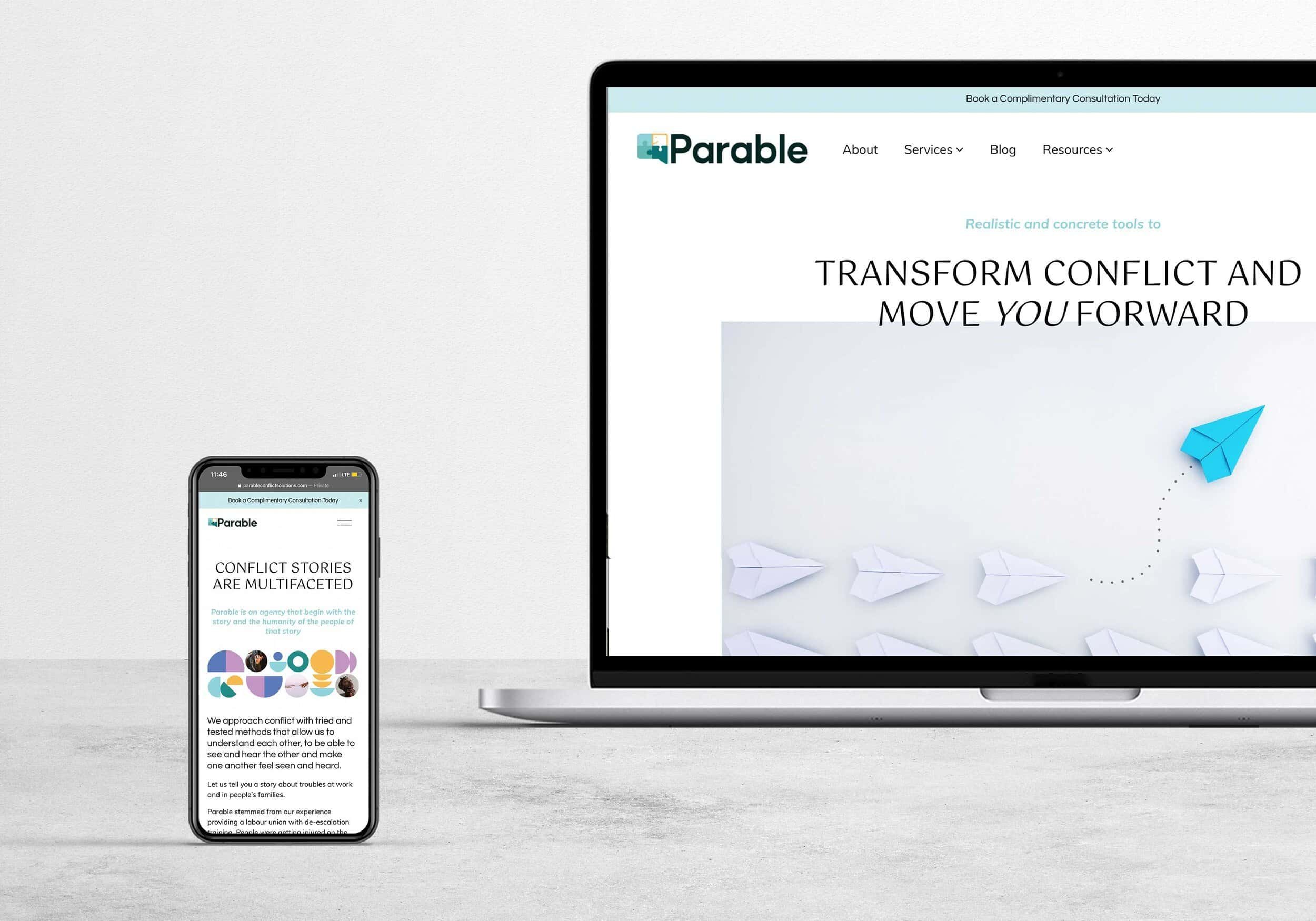
Even if the world's largest search engine wasn't prioritizing mobile responsiveness, you need to for your audience. If they are accessing your website through a mobile phone or tablet, having them pinch and zoom into the screen chalks up to an annoying user experience, negatively impacts their impression of your brand and discourages more traffic from choosing your website for their needs.
Your Website Doesn't Have An About Page
Sure, you can talk about your vision, mission, and purpose across multiple pages on your website, but people click on the About page most often to find out who's behind the brand they're interacting with. In fact, the About Page is most often the second most visited web page on a website. No matter how big and loud your brand is, new visitors want to know who's powering the brand, why they're doing it, and how they can relate to you. People buy from people.
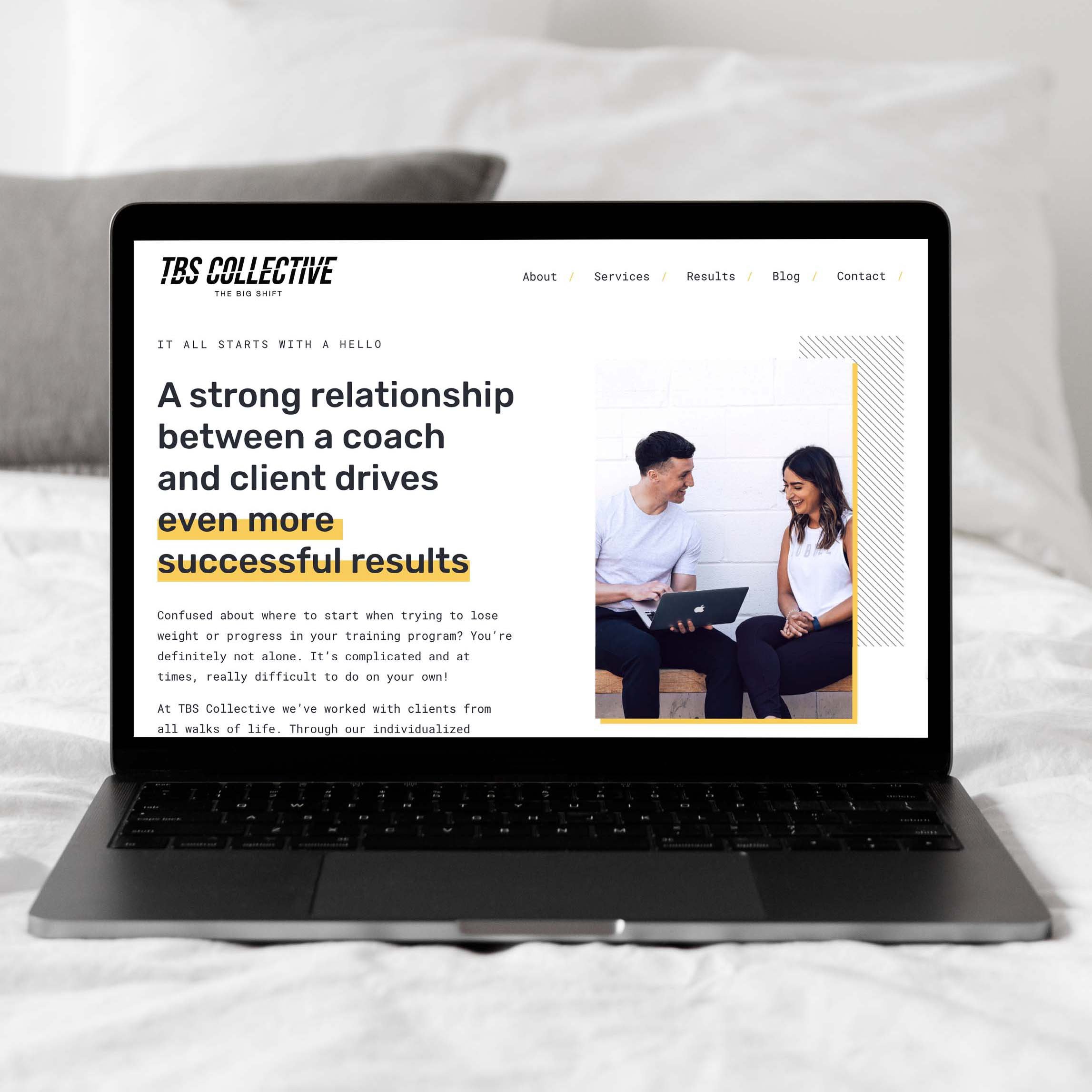
Not investing enough time and energy into your About page is a poor use of a page with so much potential. Most people are inclined to have a website that showcases what they do or make, but often forget to communicate their why—your 'About' page is perfect for this. You can also comfortably meld your contact info on the same page and do with one less web page.
Framing the content for your About page comes down to finding the sweet spot between your professional and personal appeal to your target audience. The content of your About page is so incredibly important that I've dedicated an entire blog post to it.
Your Website Doesn't Have a Favicon
The smallest detail can make a big difference. A favicon (also known as a website or tab icon) is the small image that appears on the top of a webpage in the browser. Overlooking a custom favicon is a common mistake that most website DIYs make or worse, they leave it to the default Squarespace or Wordpress favicon. This is a missed opportunity for custom branding.
Scaling down your logo to a small pixelated block is not your answer to having a favicon. A favicon should be a part of your complete logo suite. It's a design element in itself. This is a subtle way of brand recognition, and tells visitors that you've put thought into your website and that you're serious about your brand.
Don't take that 16-pixel space at the top of your web page for granted.
Your Website is Cluttered
When you're at the very beginning of your entrepreneurship journey of owning your website, it's tempting to want to tell or show your new customers as much as you can. We often mistake our own websites for in-person conversations with potential customers and jam-pack each page with information.
Once your website loads, if website visitors think there is too much to take in, they will immediately exit your website and go back to their search results to find another website with content that's quicker to read through.
Don't be afraid to have sufficient white space between website copy and images on your website. White space is your friend. The idea is to say more with less, this is where effective website copy comes into play.
With regard to navigation, make it free-flowing. You don't have to nest everything in the navigation menu. People want to arrive at the information they need fast, so they already know which web page they want to get to. Consider having a clear call to action within each section of a page.
Your Website has Overused Stock Photos
One of the most common website design mistakes is overused stock photos. I'm not painting all such photos as bad, sometimes they're necessary since we can't schedule a photo shoot when the need arises.
When it comes to picking stock photos, popularity is not your best bet. Some stock photos are very familiar across the internet and your industry, and you want to ensure your website is not just another one slapping on the same image. It looks lazy. A quick image search can tell you how many other websites have the same image.
'Getty' your freak on and choose images for your website that sync with your brand look, feel, and tone.
But typically, the best solution to custom photos that sync perfectly with your brand is to have your own photos taken by a professional photographer who understands the importance of branding.
Need recommendations for a Brand Photographer? Get In Touch
The common mistakes that I've elaborated on above in no way make a complete list. Fixing these five issues on your website won't magically make it the best version it can be, but it will lessen the gap between your website and the customers who are looking for it.